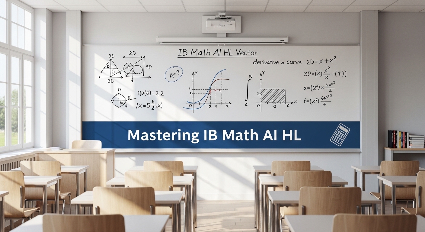
Introduction
Statistics is more than just numbers — it is the language of data.
In GCSE Maths Statistics, statistics help students understand how to collect, analyze, and interpret information effectively.
Whether you are studying averages, graphs, or correlations, mastering statistics means being able to tell a story through numbers.
At Mathzem, you will find free GCSE maths statistics lessons, quizzes, and guided exercises designed to make complex topics simple — all created by experienced tutors who know exactly what examiners expect.
Table of Contents
What Is Statistics?
Statistics is the study of data — how it is collected, presented, and interpreted.
In GCSE maths, you will use statistics to answer real-world questions like:
- What is the average test score in your class?
- How do weather patterns vary by month?
- Is there a link between hours studied and exam grades?
These questions test both numerical skills and reasoning ability — exactly what employers and examiners love to see.
Data Types
| Type | Description | Example |
|---|
| Primary Data | You collect it yourself | Conducting a survey |
| Secondary Data | Already collected by others | Census or website data |
| Discrete Data | Whole numbers only | Number of books |
| Continuous Data | Can take any value | Height, weight, time |
Mathzem Tip: Knowing the data type helps you choose the right graph and calculation method.
Collecting Data
Sampling is the process of gathering information about a population.
| Method | Description | Advantage | Disadvantage |
|---|
| Random Sampling | Everyone has equal chance | Reduces bias | May be hard to organize |
| Systematic Sampling | Every nth person | Simple | May skip patterns |
| Stratified Sampling | Based on groups | More accurate | Requires background info |
Always check for bias — if your sample is not representative, your conclusions will be flawed.
At Mathzem, you can explore interactive modules that show how sample size affects data accuracy in real time.
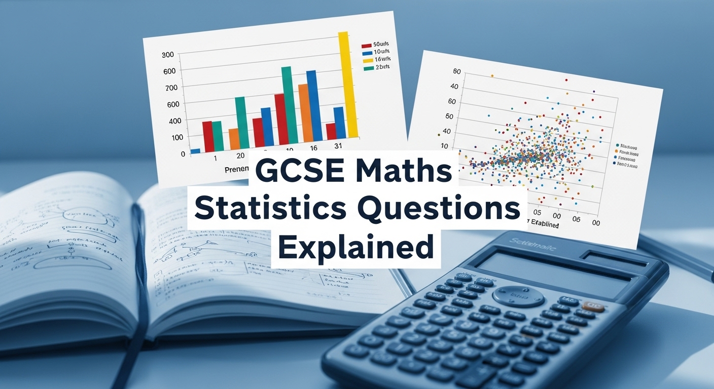
Representing Data
Data can be shown in different ways:
- Bar Charts: For discrete data
- Pie Charts: To show proportions
- Pictograms: For simple comparisons
- Line Graphs: To show change over time
Each representation helps visualize trends — a crucial GCSE skill.
Mathzem’s chart generator lets students create these graphs instantly and compare them side by side.
Averages and Range
The four key measures of average are:
| Measure | Formula | Example |
|---|---|---|
| Mean | Sum ÷ Number | (2+4+6)/3 = 4 |
| Median | Middle value | 3, 4, 5 |
| Mode | Most frequent | 4 appears twice |
| Range | Largest – Smallest | 10 – 4 = 6 |
Tip: For grouped data, use midpoints to estimate the mean.
At Mathzem, each average type includes examples, explanations, and self-check quizzes.
Frequency Tables
| Class Interval | Frequency | Midpoint | Fx |
|---|
| 0–10 | 4 | 5 | 20 |
| 10–20 | 6 | 15 | 90 |
| 20–30 | 10 | 25 | 250 |
Estimated Mean = ∑Fx/ ∑f
Estimated Mean = 360/20 = 18
Use class midpoints for grouped data when calculating averages.
Cumulative Frequency
Cumulative frequency adds up totals as you go.
| Upper Bound | Frequency | Cumulative Frequency |
|---|---|---|
| 10 | 3 | 3 |
| 20 | 5 | 8 |
| 30 | 7 | 15 |
| 40 | 5 | 20 |
Plot these on a graph to find the median and quartiles.
This is often used alongside box plots in exam questions.
Mathzem’s cumulative frequency visualizer automatically draws graphs based on your input values — perfect for practice.
Histograms
Histograms show frequency density for continuous data:
Frequency Density = Frequency / Classwidth
The area of each bar represents frequency.
Common GCSE exam trick:
Students often forget to divide by class width — avoid this by double-checking your calculations.
Box Plots
Box plots visually summarize large data sets.
They show:
- Minimum value
- Lower Quartile (Q1)
- Median (Q2)
- Upper Quartile (Q3)
- Maximum value
They are great for comparing two data sets side by side.
Mathzem’s online box plot generator lets you input data points and instantly see your quartiles displayed — ideal for quick revision.
Scatter Graphs
Scatter graphs explore relationships between two variables.
For example:
- Hours Revised vs. Test Score
If the points rise from left to right, → Positive correlation
If they fall → Negative correlation
If random → No correlation
The Line of Best Fit is drawn by eye and used to estimate missing values.
Exam-Style Questions
Let us try one together 👇
A group of students recorded their weekly study hours and average grades. Draw a scatter graph and describe the relationship.
You will find a positive correlation — more hours studied lead to higher grades.
Mathzem Practice Tip: Use its real exam question bank to attempt similar examples with instant marking feedback.
Common Mistakes in Statistics
- Misreading graph scales
- Confusing mean and median
- Using the wrong axis label
- Forgetting units in frequency tables
- Misinterpreting correlation as cause
Fix: Always label, check, and cross-verify your data before answering.
How Mathzem Helps You Master Statistics
Mathzem gives you everything you need to excel in statistics — for free:
- Interactive graphs (histograms, box plots, and scatter diagrams)
- Guided video lessons made by GCSE maths experts
- Instant feedback quizzes to test understanding
- Step-by-step problem solvers for real exam questions
Visit Mathzem.com and start learning statistics visually and interactively today!
FAQs About GCSE Maths Statistics
Are statistics on both calculator and non-calculator papers?
Yes, basic averages and data interpretation appear on both.
How can I improve in GCSE maths statistics quickly?
Practice with real questions and use interactive tools like Mathzem for visualization.
What is the most challenging part of GCSE statistics?
Understanding which average or chart to use in each question.
Are histograms and bar charts the same?
No, histograms are for continuous data with touching bars; bar charts are for discrete data.
Conclusion
Statistics might seem intimidating at first, but once you learn how to visualize and interpret data, it becomes second nature.
With Mathzem’s free GCSE Maths Statistics lessons, you will master charts, graphs, and averages — while building problem-solving confidence that shines through in exams.
Start improving today:
Visit Mathzem.com to access free GCSE maths resources and interactive practice tools.